INTRODUCTION
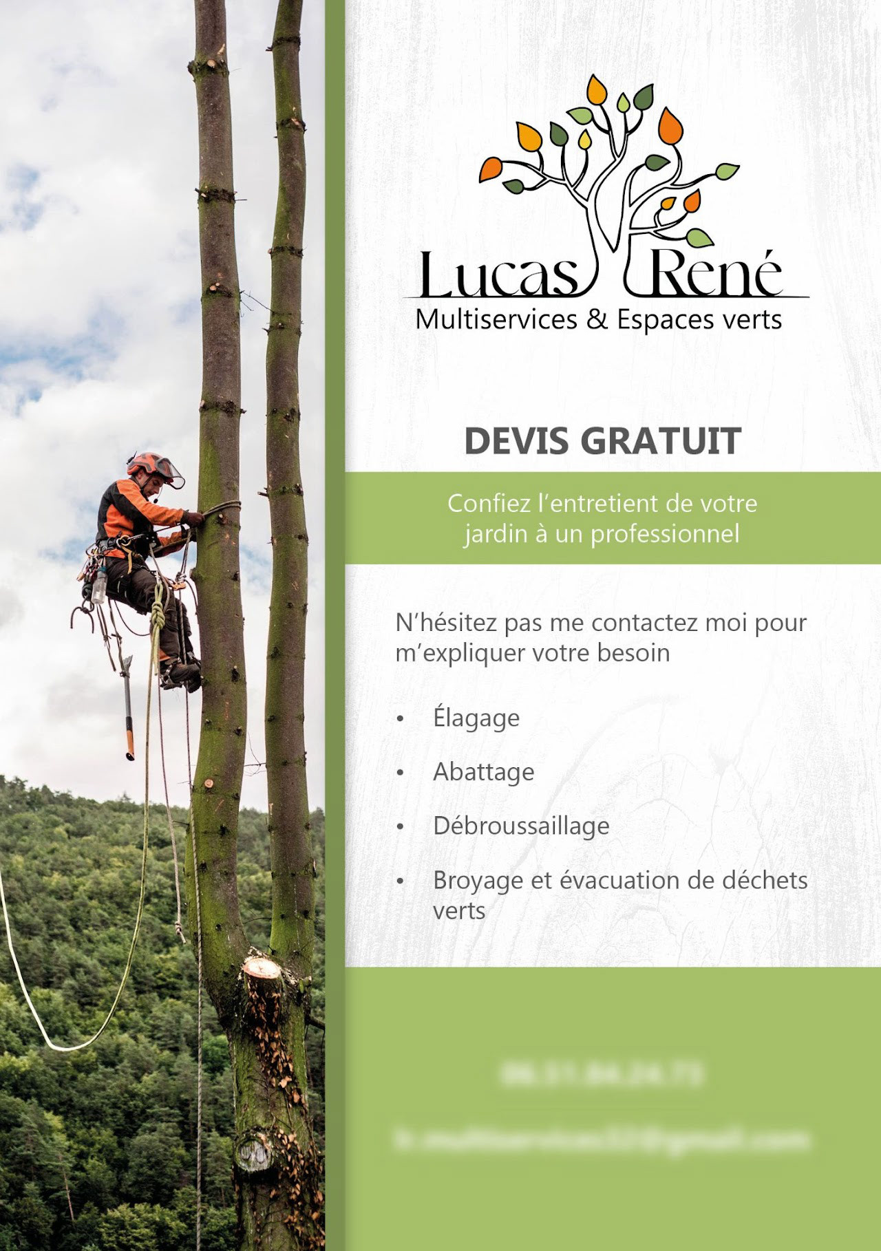
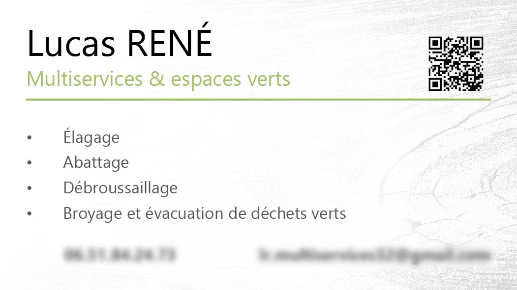
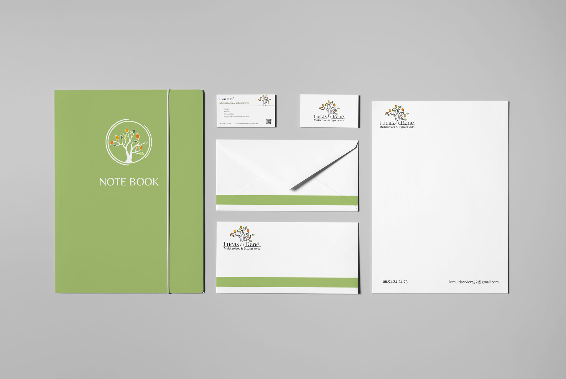
This client project was part of the launch of a self-employed business in the landscaping sector. My client, Lucas René, reached out to me to design the visual identity of his company, with a specific focus on the logo and certain elements of the brand guidelines.
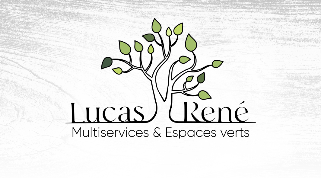
For the logo design, I explored visual representations directly linked to his field of work. Since the majority of his clientele is senior, we prioritized readability and clarity. The selected symbols – the tree, the leaf, and the stump – perfectly reflect his area of expertise.
For typography, we chose airy fonts with uppercase letters to enhance the design’s elegance and readability. While the baseline is not present on all supports, my client wishes to make it a permanent element in the future.
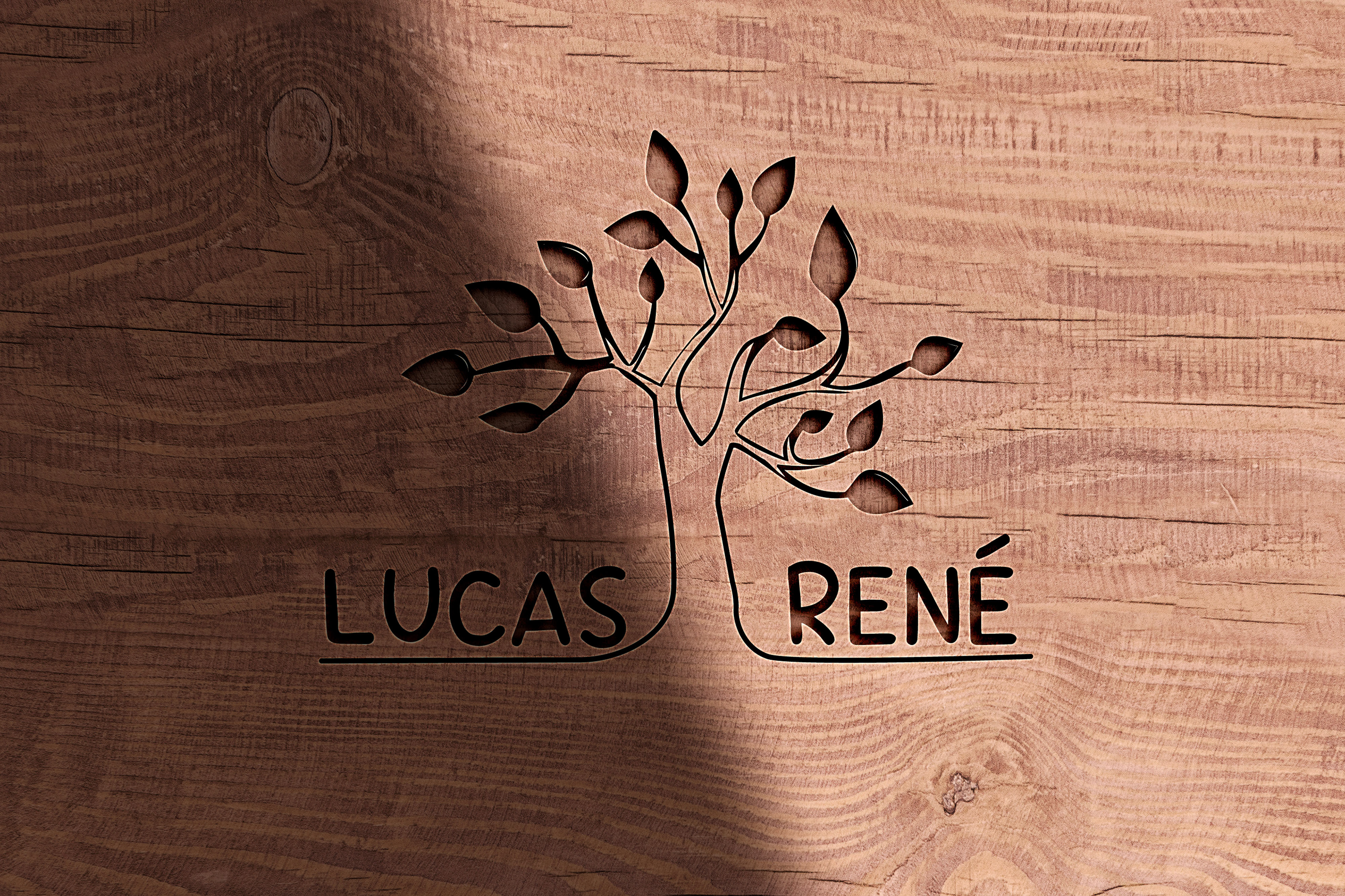
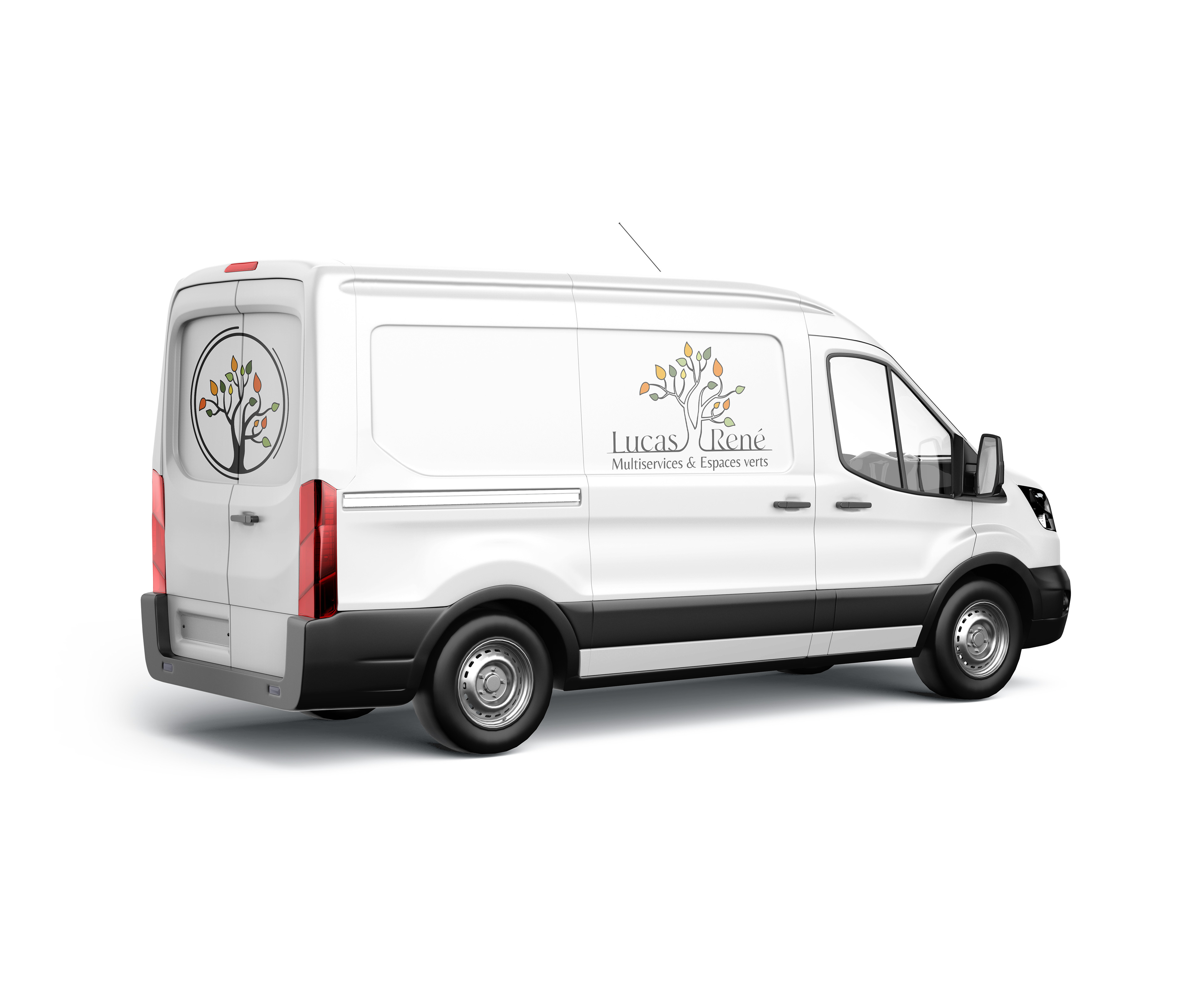
My client chose the tree symbol paired with the “Runalto” typeface. The logo adopts a classic style, combining elegance and readability. I also proposed variations featuring the tree alone, allowing the symbol to be used independently from the company name. This flexibility makes it easier to incorporate the tree into different communication materials, lightening the visuals while strengthening brand identity.
For the color palette, I drew inspiration from the forest and seasonal changes. The selected green shades evoke the freshness of foliage and springtime, providing a reassuring tone often used in logos. I also included brighter autumnal hues, to be used sparingly, adding dynamism and warmth when necessary.
For the color palette, I drew inspiration from the forest and seasonal changes. The selected green shades evoke the freshness of foliage and springtime, providing a reassuring tone often used in logos. I also included brighter autumnal hues, to be used sparingly, adding dynamism and warmth when necessary.
FLYERS, BUSINESS CARDS & MOCKUPS
