What is this project?
Deezer is a French company specializing in music streaming, offering a vast catalog of tracks and personalized recommendations based on user listening habits.
During the 7-week Bootcamp at The Design Crew, the Deezer team presented a challenge for participants to tackle.
Context : Personalization Requires Active Engagement
Deezer found that personalization boosts user engagement, especially with playlists. While the effort remains moderate, it strengthens attachment to the product and enhances the experience. Users who actively create and update playlists are more engaged and less likely to unsubscribe. Personalized playlists (title, cover image) lead to more listens and shares, reflecting the “IKEA effect,” where personal effort increases perceived value.
With varied listening habits, Deezer aims to move beyond a one-size-fits-all approach by offering more personalization options. The focus is on refining recommendation algorithms, understanding user interactions, and maximizing perceived value.
To guide our approach, they outlined three key focus areas:
Control & Transparency, Personalization, and Sharing Musical Identity."
Now, I will present how my team and I tackled this challenge.
DISCOVER . DEFINE . DEVELOP . DELIVER
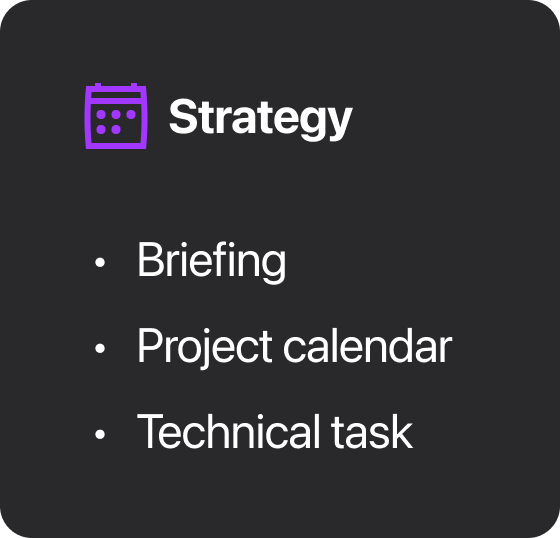
Strategy
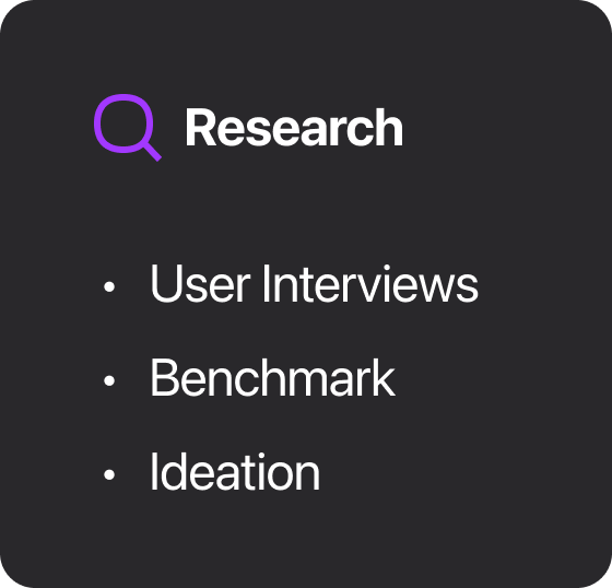
Research
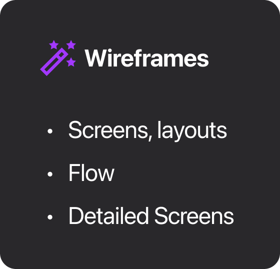
Wireframes
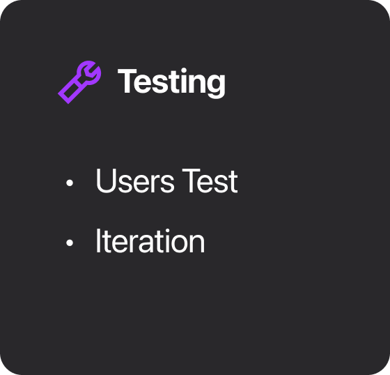
Testing
Presentation
When Deezer pitched their challenge to us, my team and I already had ideas for the Flow feature, which allows users to quickly select themes based on recommendations with predefined moods or genres. This is a key differentiator from the competition.
Better Understanding the User
We conducted 5 user interviews with two predefined objectives to implement the best possible solution.
The quote that stood out to us.
“I was at a party, I started a Flow on the ‘Party’ theme, and then it played a super slow song…
I was like, ‘Oops, sorry.’ And I switched back to my Party playlist.”
— Virginie
Based on our user interviews, we refined our solution to address a more specific problem:
This focuses on providing users with visibility into how the algorithm perceives them and allowing them to influence this data, ultimately strengthening trust between Deezer and its users.
Benchmark & Ideation for an Initial Proposal
During the Benchmark and Ideation phase, we leveraged insights from user interviews to conduct brainstorming workshops, including mind mapping, storyboarding, and competitive research. Several user experience and design ideas stood out:
1. We envisioned a solar system where user data orbits around them, inspired by Spotify’s Wrapped.
2. A multiverse concept represented different user versions based on mood and context.
3. A Tinder-like swipe mechanism was considered for effortless algorithm customization.
4. We analyzed Deezer’s past communications and noted their use of an onboarding overlay.
2. A multiverse concept represented different user versions based on mood and context.
3. A Tinder-like swipe mechanism was considered for effortless algorithm customization.
4. We analyzed Deezer’s past communications and noted their use of an onboarding overlay.
Reflect : Seeing Beyond the Flow
We developed the 'Reflect' feature, which, as the name suggests, offers users an overview a reflection of their music algorithm. We positioned this feature within the profile section, as it felt natural to associate the two.
More Visibility
This feature provides a quick overview of keywords and tags that represent what the algorithm has understood about the user—through artist names, groups, genres, or even BPM. This allows users to understand why certain songs appear when they start a Flow mix.
More Interaction
Users now have the ability to interact with the algorithm. By clicking on the pencil icon, they can modify keywords that don’t interest them and then answer a series of swipe-based questions to indicate whether they like or dislike the suggested artists. Once they respond, the algorithm updates with new keywords.
Testing Our Solution with Users
We selected a panel of five Deezer users, each with over five years of experience on the platform. Our research aimed to achieve three key objectives:
• Measure user interest in the feature
• Evaluate comprehension
• Observe interactions
Our Observations and Learnings
Insight 1
The existing “Flow” feature is unclear, generating curiosity among all users, with 5/5 raising questions about its functionality.
What happened?
• Users often encounter unexpected recommendations in Flow or when testing sub-Flows.
• They don’t fully understand sub-Flows, and the icons are unclear.
• They find each mood highly subjective and difficult to interpret based on their usage
Our Actions:
• Made the page unique with a Bottom Overlay.
• Simplified the interface.
• Rewrote explanations for each sub-theme.
Insight 2
Our feature lacks accessibility and seamless integration into the user journey, as shown by the fact that only 2/5 users clicked on the CTA naturally, while 4/5 did not read the introductory text.
What happened?
• Users mostly overlooked the text on the Home page and searched for the feature in multiple places.
• This aligns with the highly mechanical way they interact with the app.
• This aligns with the highly mechanical way they interact with the app.
Our Actions:
• Added more entry points (from the player and Flow settings).
• Simplified and made the CTA more visible on the Home page.
• Removed the “Reflect” name, as it added unnecessary complexity to the new Flow-related feature.
• Simplified and made the CTA more visible on the Home page.
• Removed the “Reflect” name, as it added unnecessary complexity to the new Flow-related feature.
Insight 3
The concept is clear, but the affordance needs significant improvement, as 4/5 users didn’t understand how to modify the wheel and keywords, and 3/5 attempted to click on non-clickable areas.
What happened?
• Users struggled with interactions within the feature.
Our Actions:
• Added a short onboarding flow to explain how it works and reinforce the feature’s value proposition.
Insight 4
The Tinder-like flow is appreciated but feels inconsistent with the rest of the experience, as 4/5 users didn’t expect it to remove an item, and 4/5 attempted to click instead of swipe.
What happened?
• The swipe is not intuitive.
• There was no neutral option.
• The UX writing needed significant improvement
• There was no neutral option.
• The UX writing needed significant improvement
Our Actions:
• Replaced the overlay with a bottom sheet.
• Added a neutral option for uncertain users.
• Refined UX writing to focus on theme relevance instead of preference.
• Swapped emojis for a check, cross, and question mark to neutralize interactions.
• Added a neutral option for uncertain users.
• Refined UX writing to focus on theme relevance instead of preference.
• Swapped emojis for a check, cross, and question mark to neutralize interactions.
Discover the prototype
The project was in French, so the prototype will also be in French. Since it’s a prototype, not everything is clickable, but you’ll be able to explore the core functionality for customizing your Flow and its sub-themes.
Feedback from the Deezer team
During the presentation, Deezer’s team (PM, two designers, and VP) gave positive and constructive feedback. They appreciated the solar system-inspired design despite its complexity and flagged potential imprecision in keywords like BPM. The Swipe method was seen as promising.
With more time, we would have explored:
• A musical immersion, with audio previews for each keyword.
• Advanced customization, allowing users to add playlists or highlight artists.
• Music identity sharing, to enhance engagement and user connection with Deezer.
Thank you for your reading!
