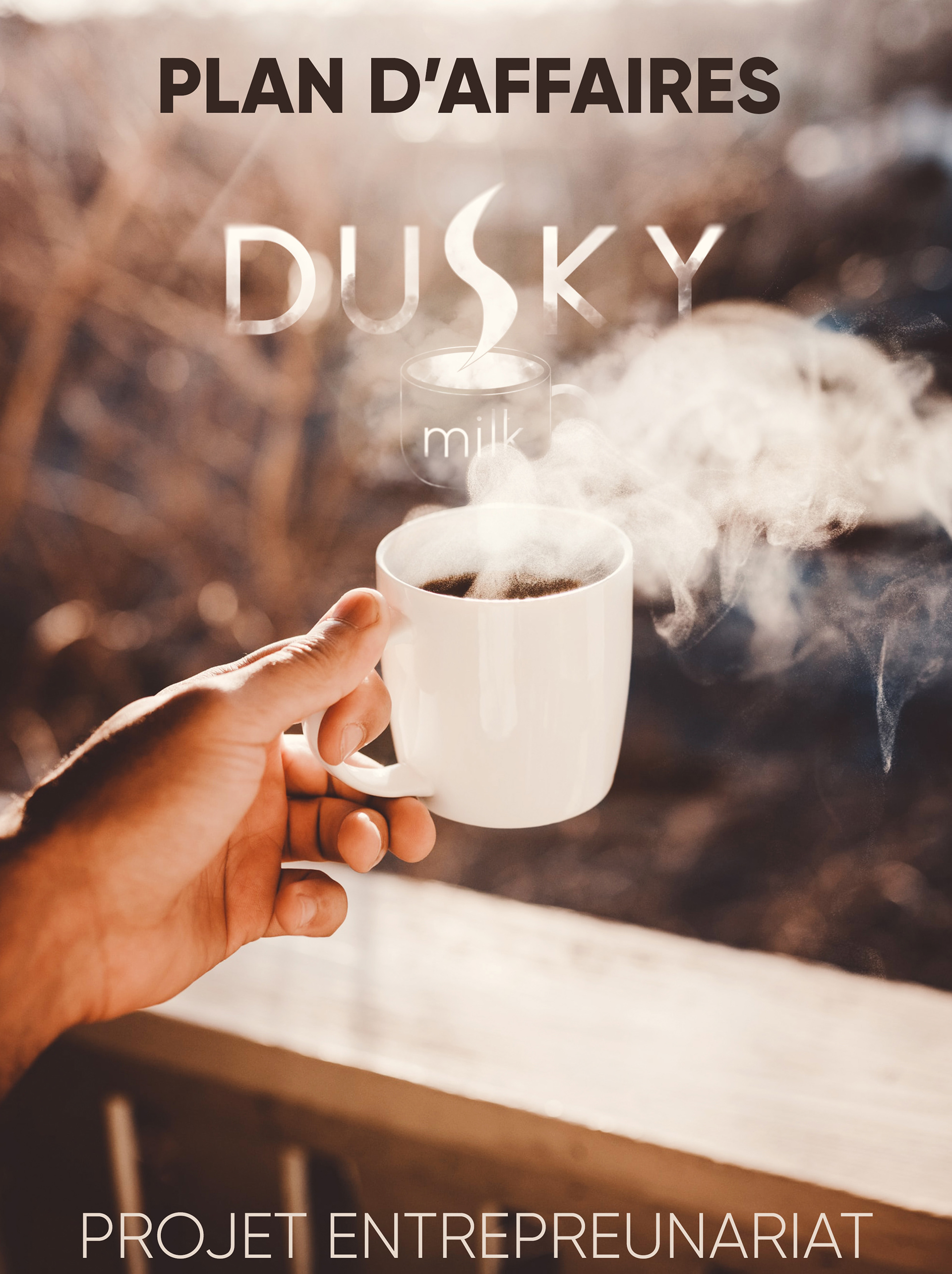
Dusky Milk is a fictional project from an entrepreneurship course. It was not a revolutionary concept, but the idea was to open a coffee shop designed to work optimally for teleworkers. The project was born at the beginning of the Covid-19 health crisis with the rise of teleworking in France. With my team, we wanted to offer a place adapted to people who could not work from home.
My tasks for this project were the design of the graphic identity and the optimisation of the place. The logo had to reflect the concept, i.e. both professional and cosy to represent the co-working space and the coffee shop aspect.
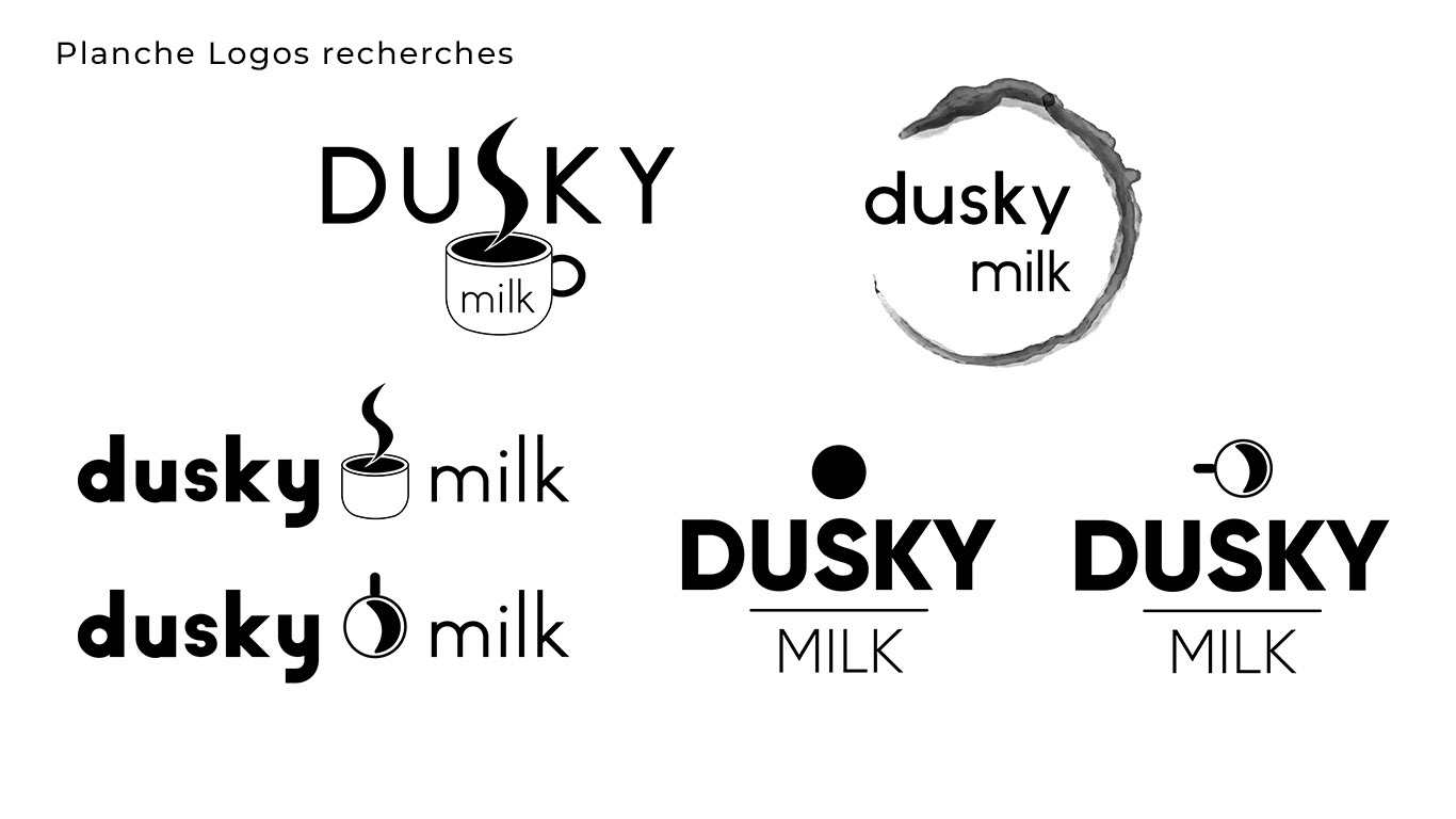
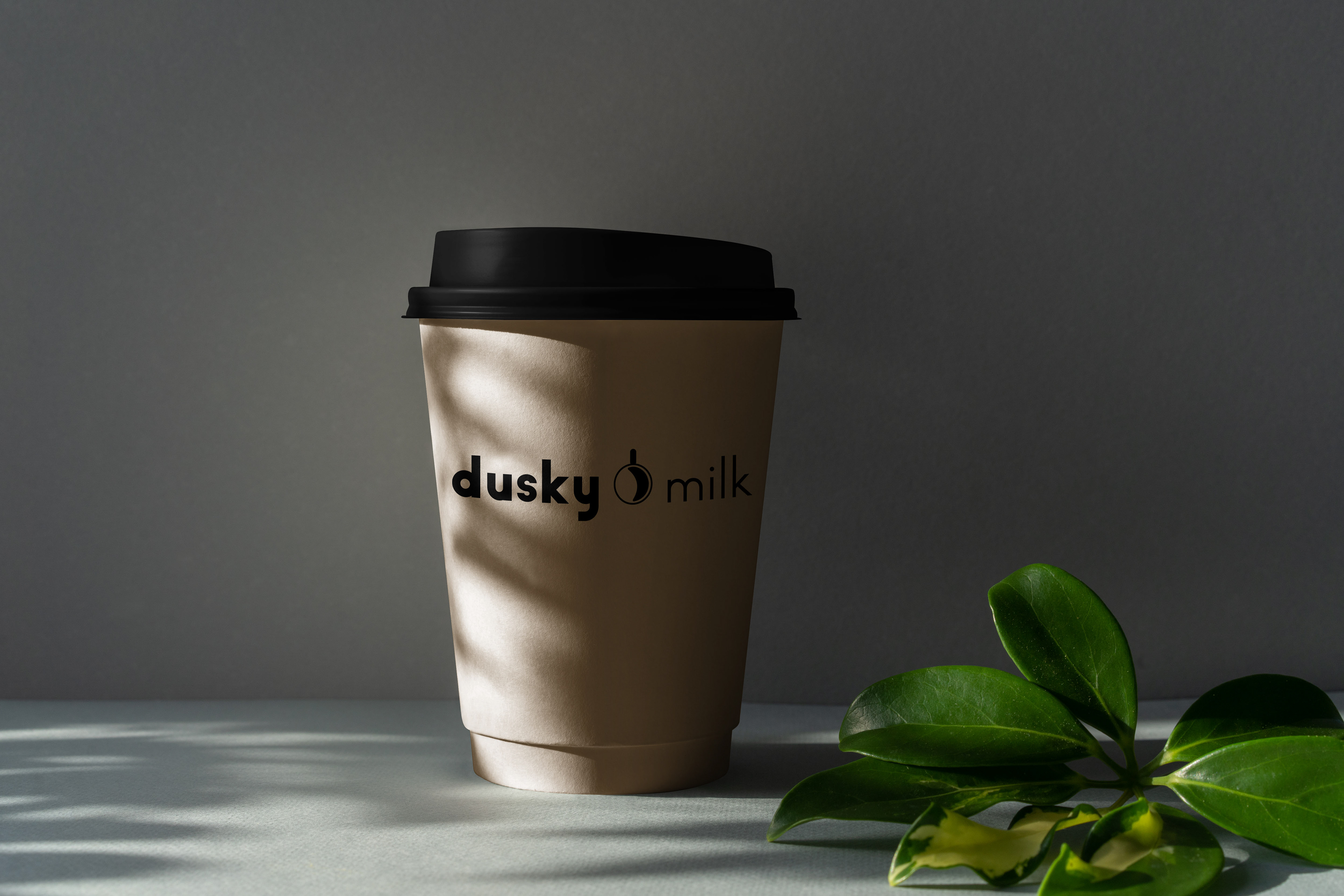
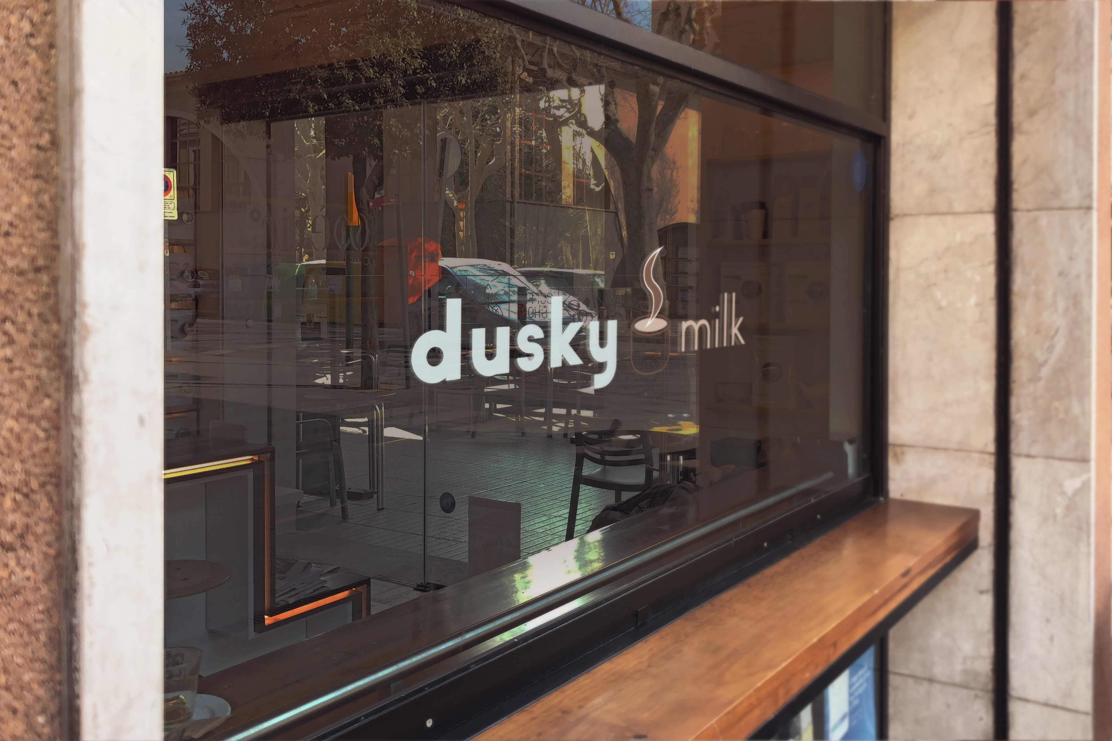
For the logo research, I wanted a Sans Serif font with sober characters and square serifs to represent the professional aspect. For the symbol that goes with the name "Dusky Milk", I preferred to refer directly to a cup of coffee with a graphic style close to minimalism.
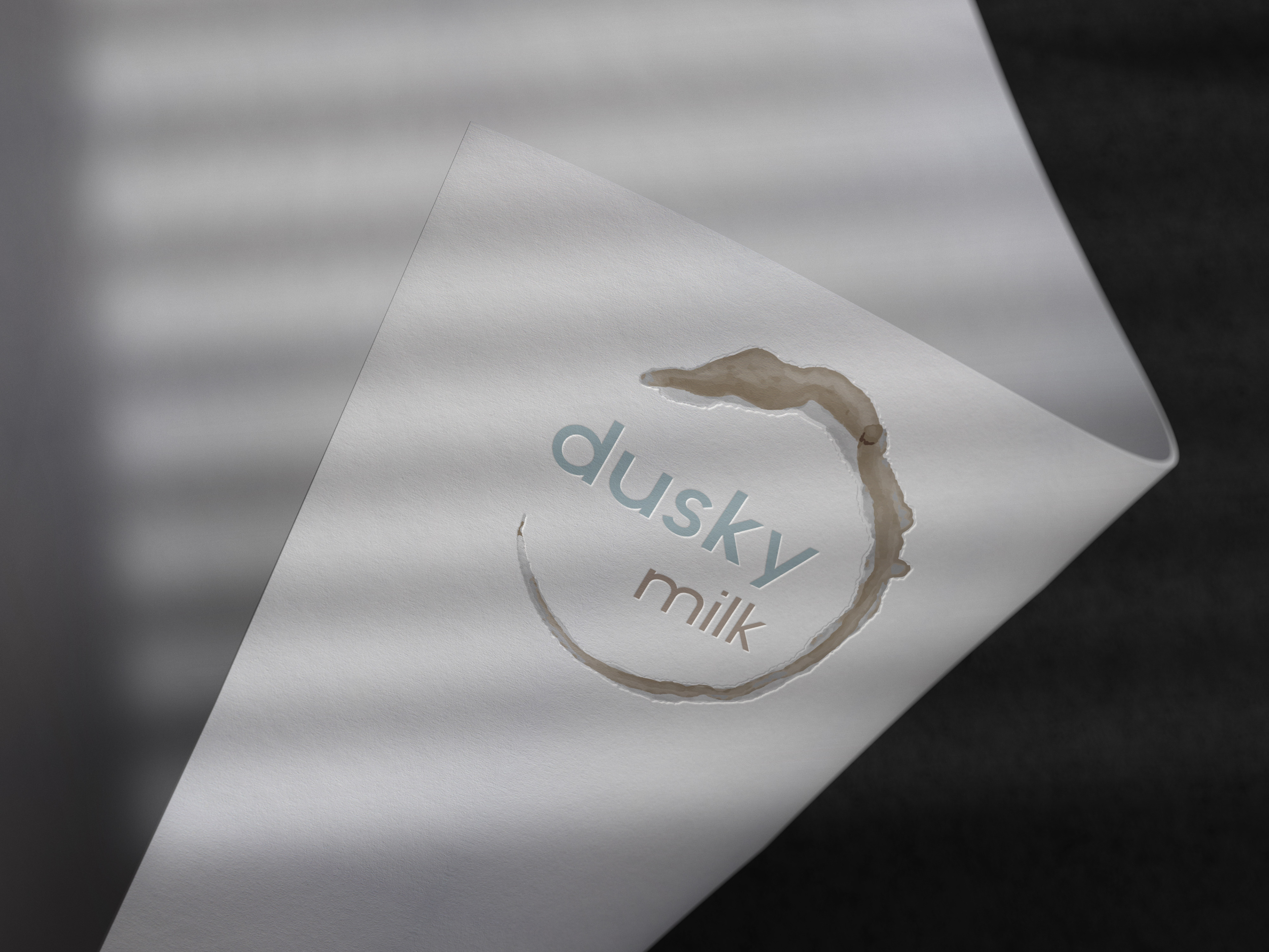
The colour pallet is composed of cooling hues to enhance the spirit of concentration and deep work. I was inspired by the images below by choosing visuals that evoke escape and vitality. We use two main colours (Hex #BFD4D9 & #BFB0A3) which I think inspire calm and meditation.
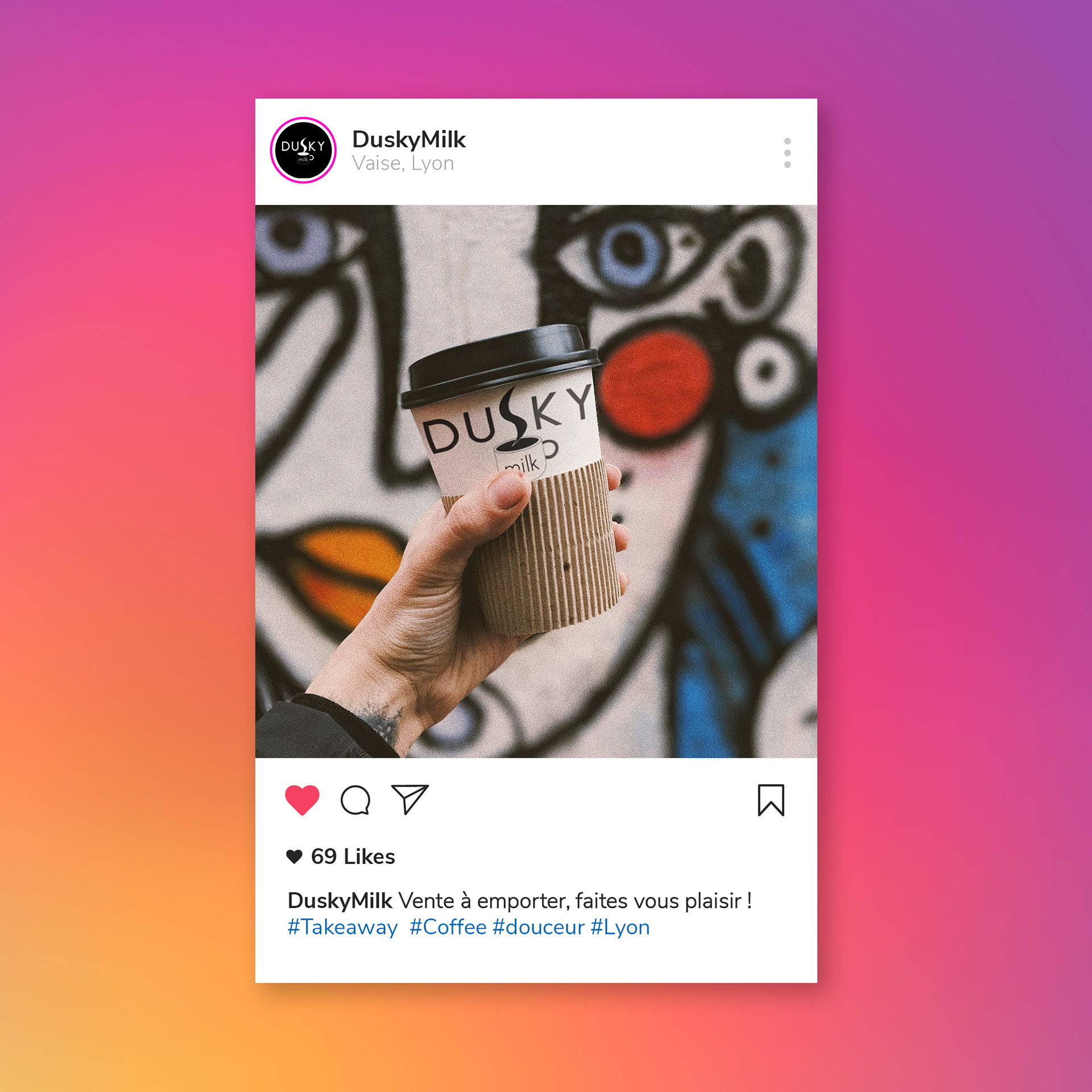
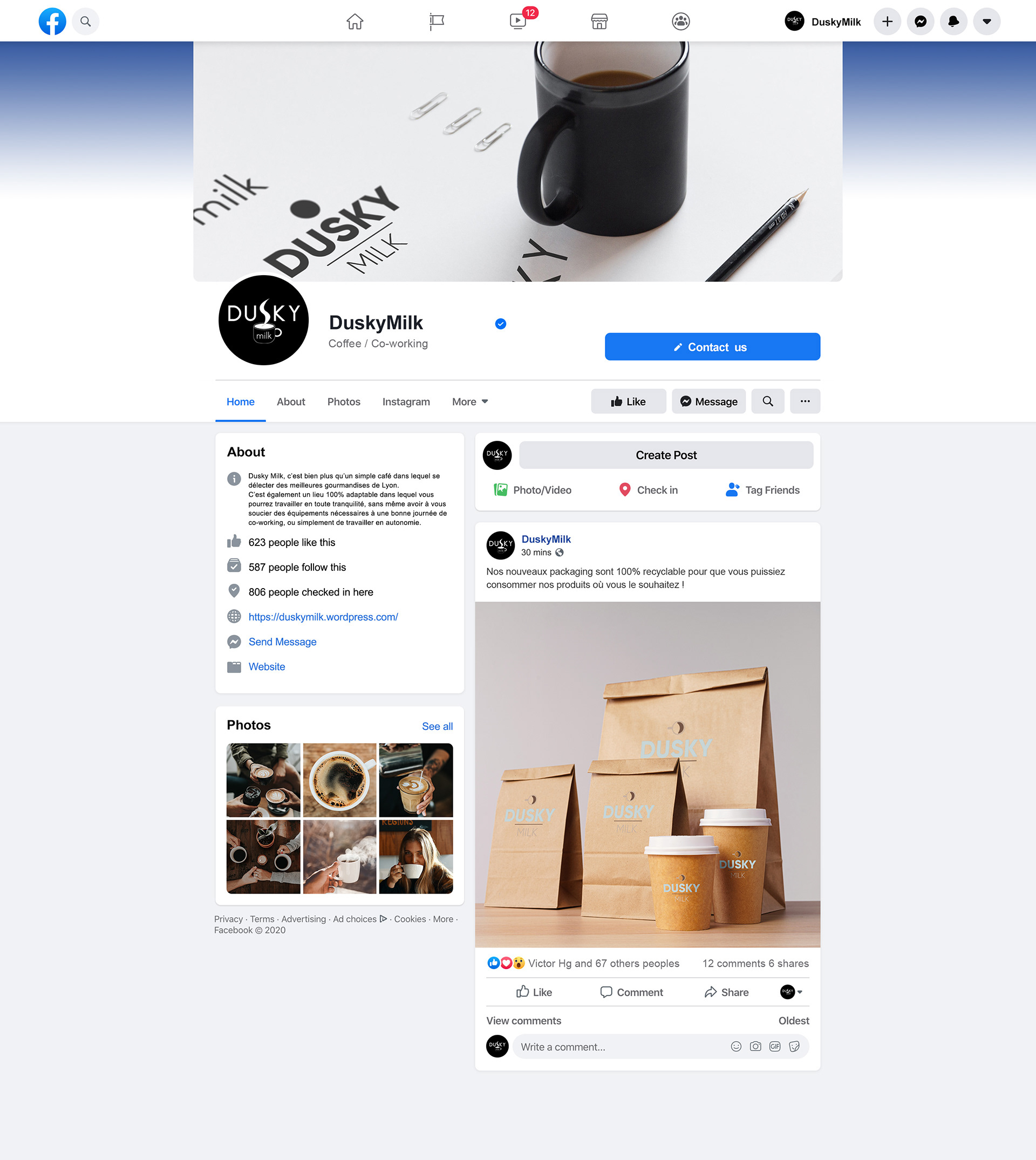
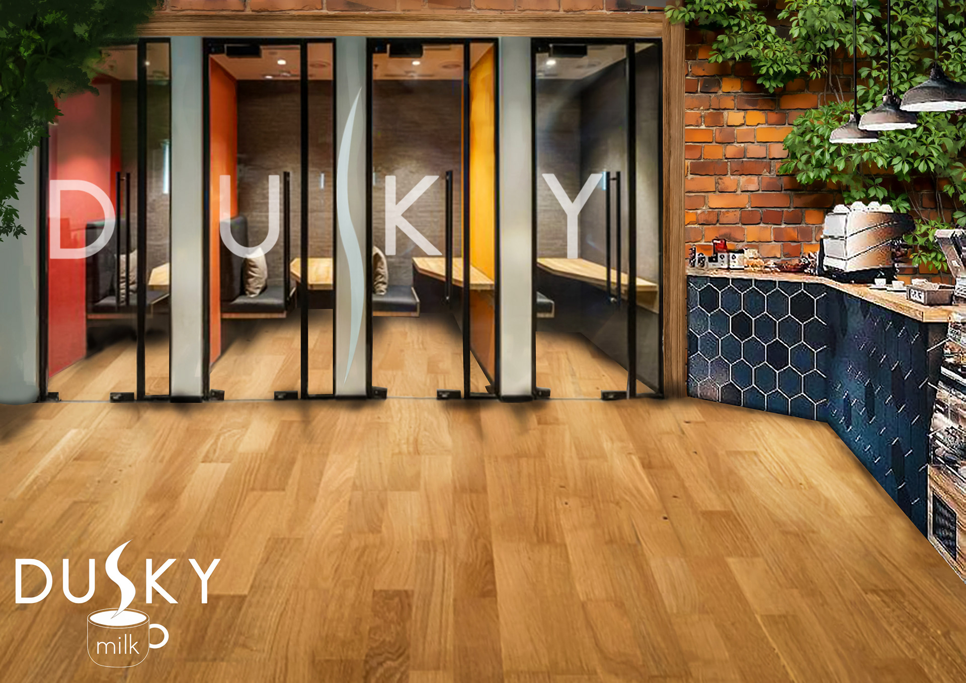
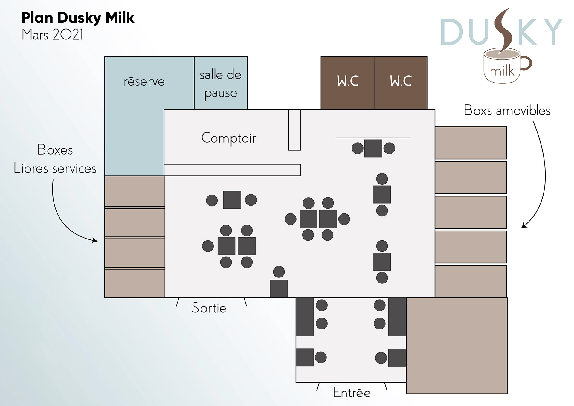
For the interior, we wanted an urban style, with a mixture of wood and brick. The presence of plants throughout the room was a very strong desire. We also had to think about work cubicles to allow people to isolate themselves if necessary.
Thank you for your attention and I hope you will be able to see my artistic evolution through the publications. See you soon ! :)
